|
|
|
|
|
|
 |
||||||||||||
|
|
||||||||||||
|
||||||||||||

|
|
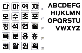 |
The exclusive writing style
for the Korean alphabet is used chiefly for the names of Daesung's
affiliate companies and for brand names. It has been specially developed
to harmonize with the logotype to achieve a uniform image. In using characters, photoengraving production methods or slide-film-based projection reproduction methods must be employed in principle. Characters may, however, be designed and used according to the individual characters' features for as long as they have the same composition principles as the characters listed in this manual. |
|
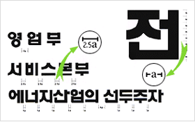 |
Space between characters may very depending on the
conditions and requirements of the medium to be used.
The arrangement intervals are classified into 1a, 1.5a, 2.5a and 4a, with the height of a whole character being 8a. Caution should be taken not to damage the formative image or disturb the balance. |
|
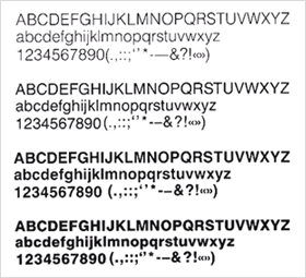 |
Daesung's English writing style is used chiefly for English titles in visual media, and is specially designated to harmonize with the English logotype as well as with the Korean and Chinese logotypes so as to achieve greater image uniformity. | |
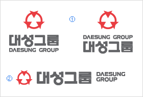 |
The signature is designed with the intention of systematically
and effectively combining the corporate identification system's basic
elements, i.e., the logo and the logotype, so as to form a more unified
and easily recognized image.
For accuracy, photoengraving reproduction methods using reproduction meterials is preferred. |
|
 |