|
|
|
|
|
|
 |
||||||||||||
|
|
||||||||||||
|
||||||||||||

|
|
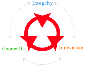 |
Daesung Group’s corporate symbol consists
of a circle and three arrowheads. The circle symbolizes harmony and
unity while each of the three arrowheads represents the three keywords
of our motto: Integrity, Goodwill, and Innovation. The symbol reflects Daesung's dedication to country and society, honesty and diligence, creativity, and to an innovative, future-oriented outlook. |
|
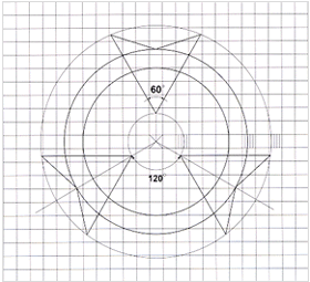 |
The Daesung Group corporate symbol is an intergral part of our corporate image, and as such, any misuse of the symbol compromises our integrity and will result in damage to the Group's overall image. Composition of the symbol via photoengraving or projection reproduction is highly recommended; however, in the case that such methods are unavailable, please refer to the grid diagram for assistance. | |
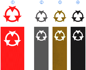 |
The Daesung Group corporate
symbol reflects our corporate values and image, and as such, the accurate
use of the following colors is also required: The official color of the Group’s corporate symbol is DS Red (PANTONE 185C); the following variations are also acceptable: ① DS Red (PANTONE 185C) ② DS Dark Gray (PANTONE CG11C) ③ Gold or Silver ④ Black |
|
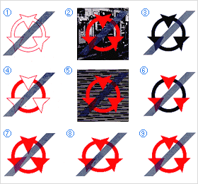 |
The original value, meaning, and significance of the
Daesung Group corporate symbol is retained and expressed only with
proper use. Following are examples of improper use of the symbol: |
|
 |