|
|
|
|
|
|
 |
||||||||||||
|
|
||||||||||||
|
||||||||||||

|
|
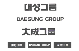 |
Daesung Group's
logotype was designed to project a strong but gentle, reliable and
modern impression, and as such, reflects both its founding spirit
and its future-oriented vision.
The Group's logotype is vital to increasing the company's worldwide recognition and association, thus we do not permit any misuse of it. The Group has logotypes in three languages: Korean, English, and Chinese. |
|
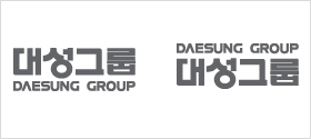 |
We require that both Korean and English logotypes strictly follow their respective guidelines when appearing together. Composition of the logotype via photoengraving or projection reproduction is highly recommended; however, in the case that such methods are unavailable, please refer to the following grid diagram for assistance. | |
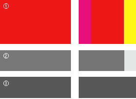 |
The exclusive color of the Group’s logo is DS Red-a
color that represents novelty and refinement. DS Dark Gray and DS Gray can also be used as background colors or for the logotype. Color accuracy is required to ensure proper representation of the Group's corporate values and image. In the case that the exclusive colors are unavailable, refer to the following color combinations to make a match: ① DS Red (PANTONE 185C) = Magenta 100% + Yellow 90% |
|
 |